The down low on the new dashboard
We’re always finding new ways to make your energy insights clearer, smarter and more useful. That’s why we’ve given the web app experience a refresh - with a few handy updates designed to help you understand and manage your energy even better.

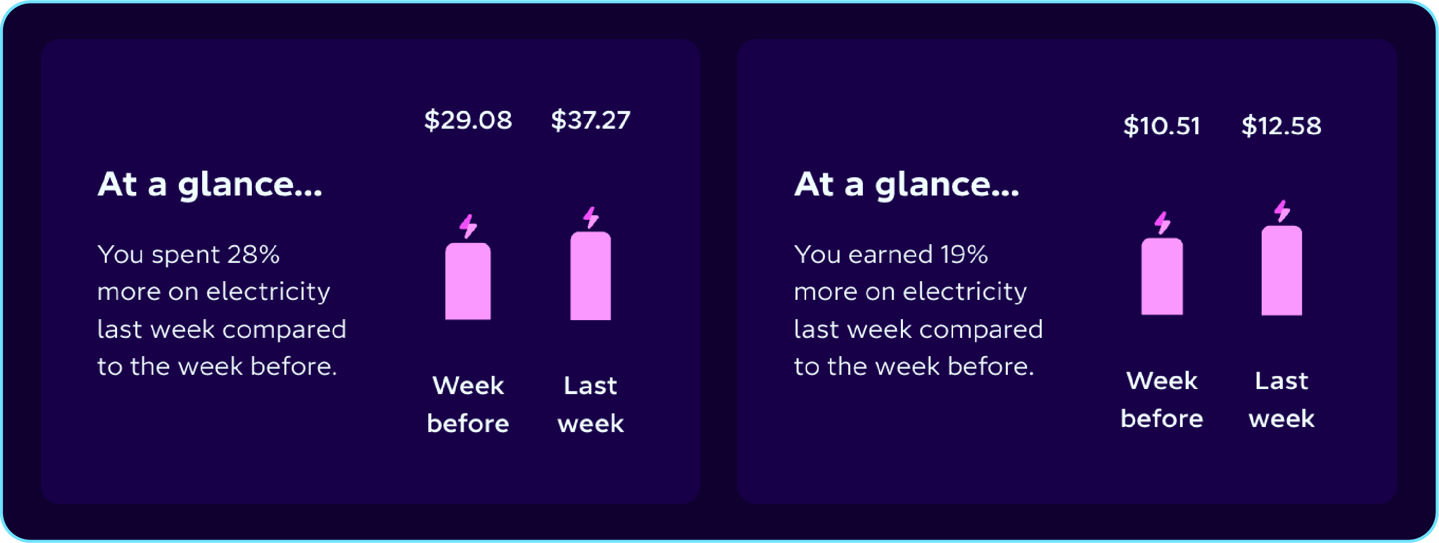
At a glance
Open the web app and head to My Energy to instantly see how your electricity use compares to last week - no digging required.
If you have solar, you’ll also see a quick snapshot of how much you’ve earned from exporting energy this week, compared to the week before.
Dive into your usage
This is where things really come to life. We’ve made a stack of updates to Usage to make it clearer, easier to navigate, and more useful than ever. Here’s what’s new:
Custom date picker
Want to check your electricity use from last month, or zoom in on the first week of March? The new custom date picker makes it easy. Switch between day, week, or month views.
Navigation arrows
A small change that makes a big difference. The arrows now sit in the top-right corner, so you can easily move between different usage periods.
Plan details
Not sure which plan you’re on? You can now see your current plan directly below the usage graph. Click in to get a full breakdown, including pricing and timing.
Toggle between kWh and NZ$
Choose how you view your usage. Switch between kWh and NZ$, with the NZ$ view showing your daily fixed charge, just like in the mobile app.
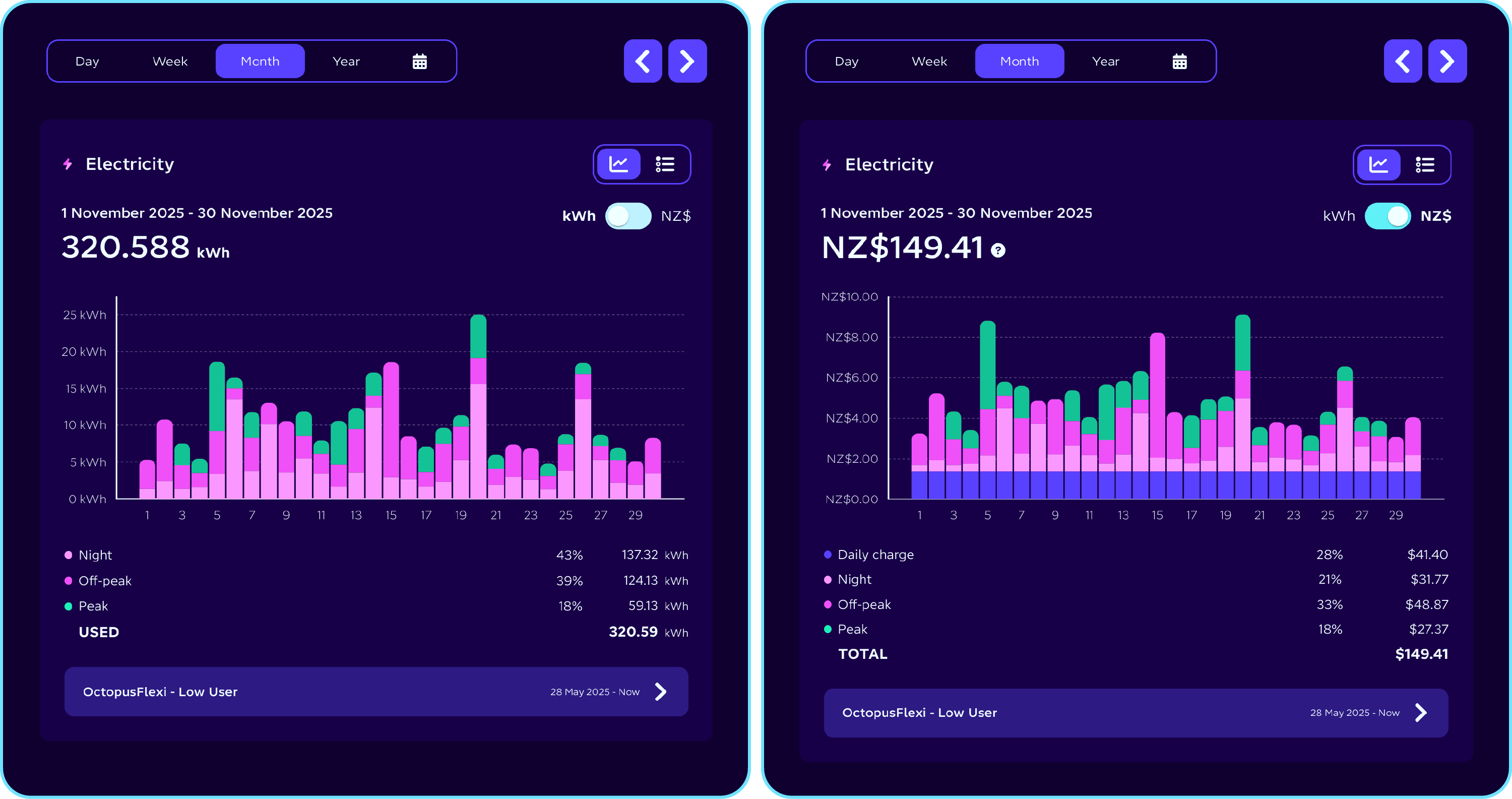
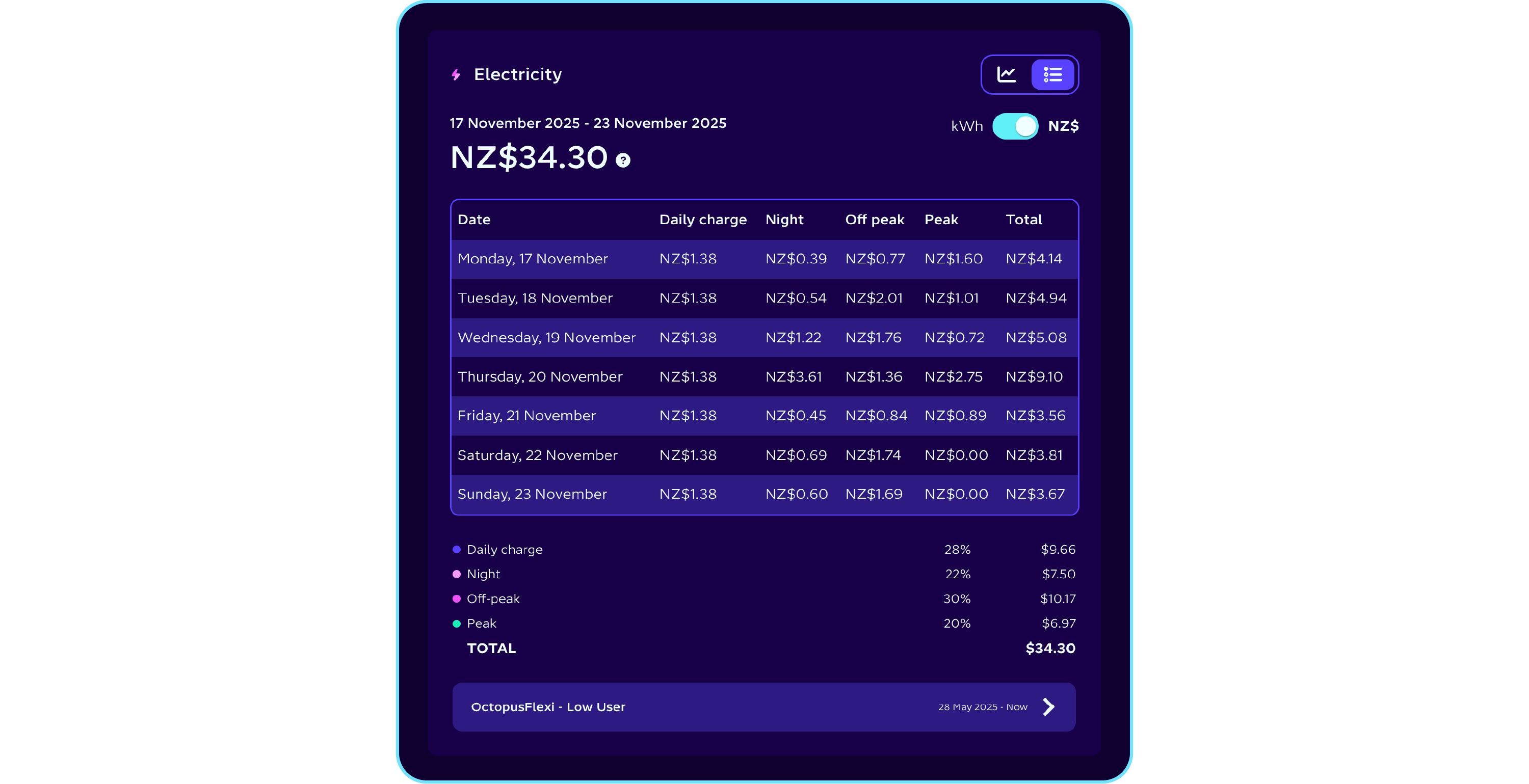
Table view
Prefer numbers over graphs? You can now toggle on a table view to see your usage broken down clearly and simply.
Bonus: when viewing daily usage, the table shows your energy use hour by hour.
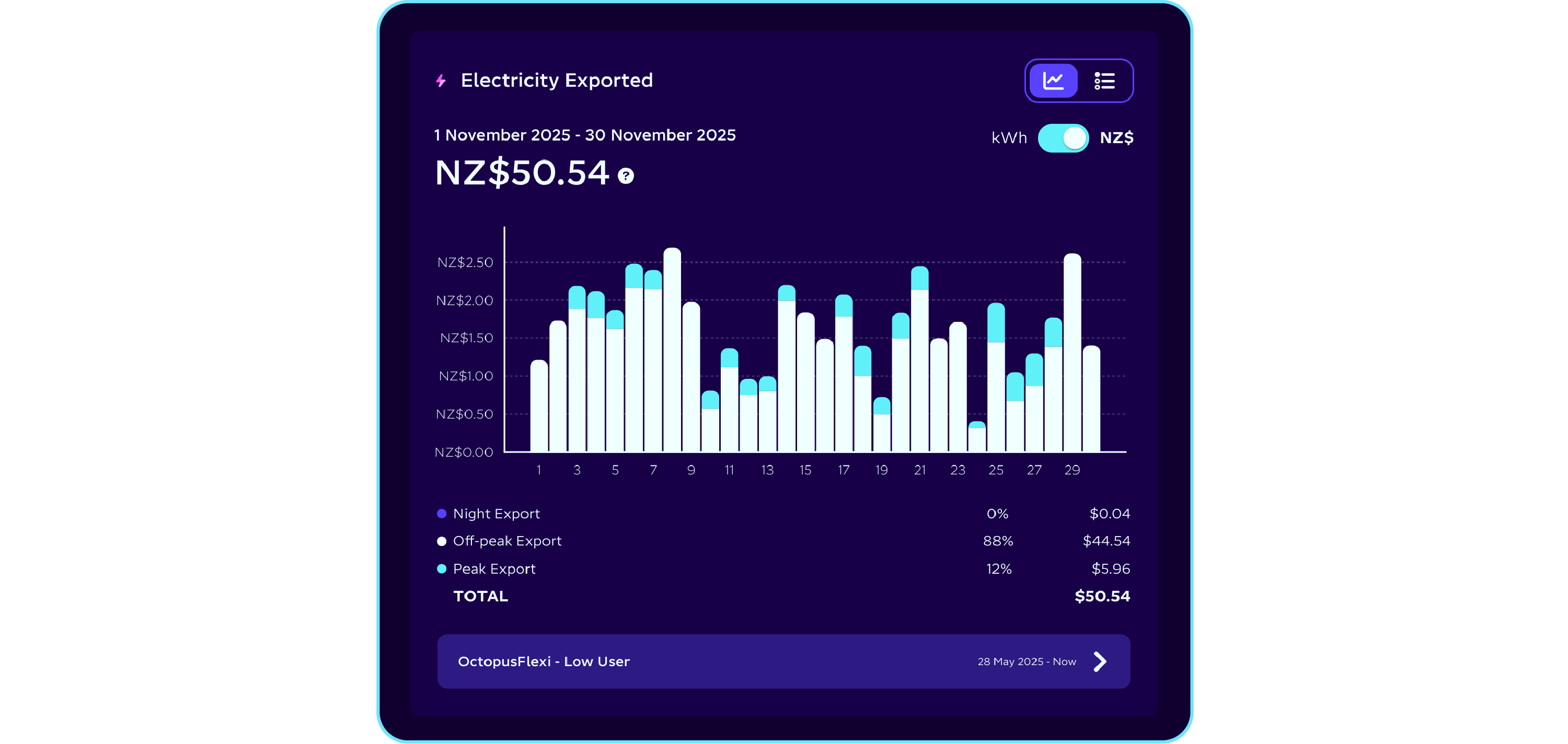
Solar export
Got solar? We’ve made this clearer too. Solar export now has its own dedicated graph, located just below your electricity usage.
You’ll find the same handy options here - graph or table view, kWh or NZ$ - making it easier than ever to understand how much energy you’re exporting and what you’re earning from it.